Setting the stage
In November of 2023, I was invited by Andrea Levy-Moore to take some photographs of Moore-ish Caribbean Cookhouse‘s grand opening in Paris, Ontario.
I had done work previously with Andrea, helping her apply for Digital Main Street‘s $2500 Digital Transformation Grant, and we had a great working relationship. I didn’t get an opportunity to try her food that day, but I know from our time together that she’s a great person and I enjoyed working with her very much.
Anyway, that’s the long way of saying I was there more in a social capacity than in an official photographer’s role, but that didn’t stop me from bringing along a camera to shoot some photos that she could use for her social media and website.
The comparison
An interesting part of photographing a small business’ grand opening is that you get to compare your photos to the dozen other photographers there that day. And so that’s what I’ll be doing.
The County of Brant sent along a photographer who took these photos, which will be the basis of my comparison.
Here they are for reference:
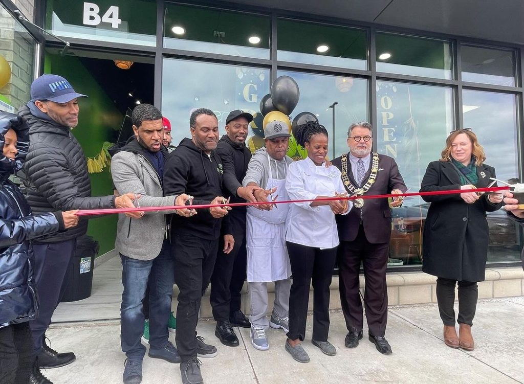
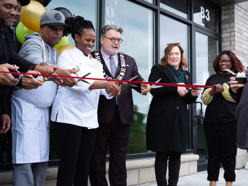
The ribbon cutting
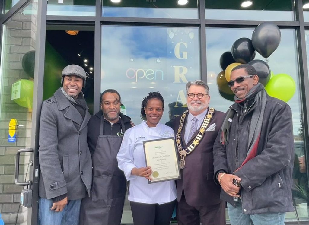
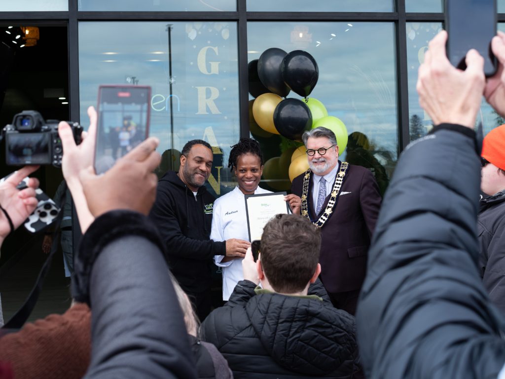
The certificate
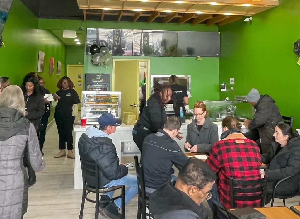
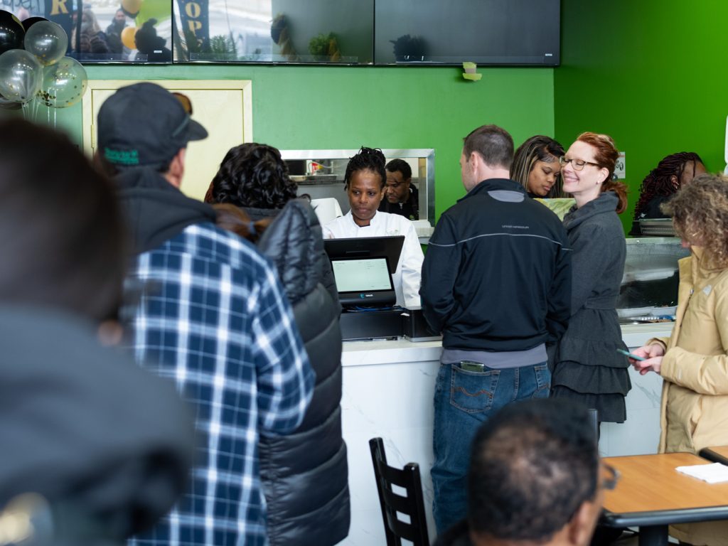
The interior
Interested in event photography for your own small business? Reach out to schuyler@eatprayshoot.com with your date and budget.
First things first: use your feet
If you’re doing DIY event photography for your business’ social media accounts, I assume you’ll be shooting with a smartphone. Shooting with a smartphone limits your ability to make visual improvements to your photos later (as you can see from the Instagram link above to the original photos, they’re aren’t of a great quality.)
But you can make some of that quality loss up with shot composition, and that means moving your feet. So as you see here with the ribbon cutting shot, this is a pretty standard shot. Not bad. Not great:
What it has going for it is that it’s not a flat, head-on shot, which always look dead; without life. Dimensionality and life comes from a slight angle, because angles show more “identity” in your subjects.
Think of Homer Simpson.
Straight ahead Homer looks strange and lifeless. The symmetry of his hair, head, ears, eyes and nose gives a kind of mathematical rather than human/personal aspect.
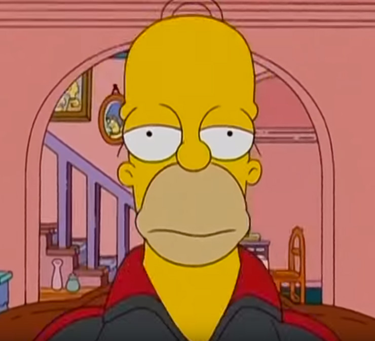

From an angle is how we like him. He has more personality and is just plain easier to connect with, because the 45° angle gives us more insight into him and his personality.
So in the case of the ribbon cutting photo, take a big step left to reveal more identity in your subjects. This angle also creates more dynamic lines and drama in the ribbon, the tops of the windows, curb, etc. Like this:
Next: take a step back
In the case of the certificate photo however, taking a step left or right might not feature the subject of the photo quite as prominently (which in this case is the certificate itself, rather than the people.)
Take a look:
So how do you add visual interest to a straight-ahead shot like this?
Well, like the title says, take a big step back and reveal what else is happening in the scene.
There you go. By filling the frame with arms and heads and cameras and smartphones we actually give more clarity to the event. In my shot the certificate itself is even obscured by a head, but it doesn’t matter because the significance of the event is so heavily implied by all the bodies clamoring for a photo.
If you’re just learning about shot composition and its relationship to storytelling, really understand this comparison. Scroll back up and compare the 2 photos again. Which one makes you want to try Andrea’s food more? Five people holding up the certificate? Or a crush of people all huddled together in celebration of Andrea’s achievement?
Most importantly, which photo gives Andrea’s food more credibility?
Lastly: if you can’t move your feet, get cropping
The photo that was taken of Andrea’s interior definitely lacks focus:
This could have been improved by cropping into the right of the photo, where there are lots of bodies.
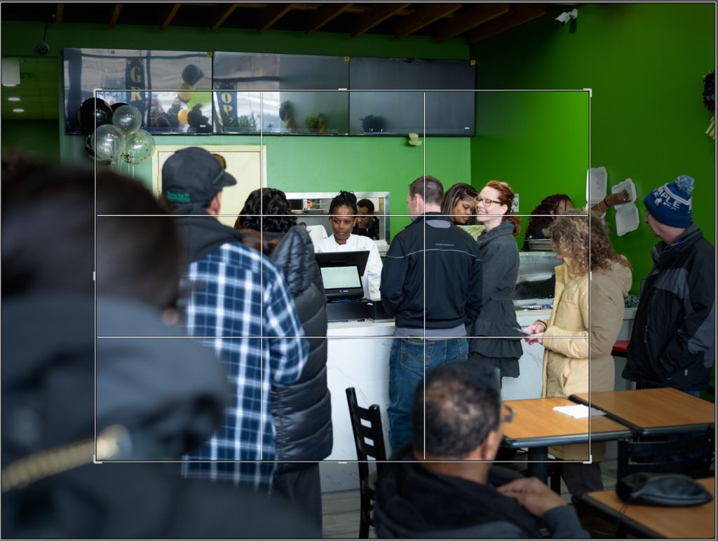
That’s what I did with the photo I took of the interior:
As you can see, we have lots of bodies, heads in the foreground, activity and life, and that’s because I eliminated negative space by cropping in from this:
Cutting out some of the less focused elements worked pretty well here. And I also got to feature the smiling woman in the right of the frame, which offsets a bit of the fatigue from the staff in the centre (long day for Andrea & co.)
Contrast. Saturation. Temperature.
These settings are adjustable from within your phone. Definitely make sure to use these features, but use them sparingly. Somewhere between 5-10%. Should look like this:
Contrast: UP – 8% (to make blacks darker and give photos a bit more professionalism.)
Saturation: DOWN ~ 5-8% (after increasing contrast, you’ll notice faces become red; reducing saturation will correct that.)
Temperature: OFFSET ACCORDING TO CONDITIONS ~ 5-8% (if you’re outdoors on a cold day, make the shots a bit warmer; if you’re indoors like I was on this day, cool your photos off.)
Finally
Remember, a great action, pose, or expression can supersede all of the above.

Here we’re flat against a wall; no angles, no guiding lines, nothing. But Andrea’s happiness is so infectious that the photo still works.
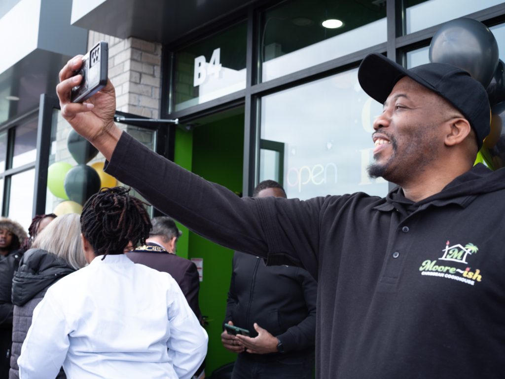
Here’s a staff member so thrilled about the opening that he just had to take a selfie. Literally no other part of this photo works; faces obscured, everyone leaving, showing their backs, no coherent composition. But again, his candid moment overcomes all of that and the action ends up telling a nice little story.
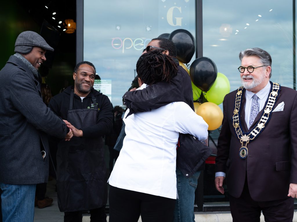
And again; obscured faces, divided groups, the mayor looking a bit listless, but the hug, the handshake and the chef’s genuine expression tell a little story of their own that mostly overcomes all of that.
The point is, try out some of the composition and post-production ideas above, but also make room for spontaneity.

Visit eatprayshoot.com for info about event, branding, and product photography, as well as a host of other digital marketing services. We work regularly in Brantford, Paris, St. George, Burford, and other communities in and around the County of Brant.